Don’t know which size to use for your image or video? We’ve listed common aspect ratios to help you create your next project.
What is an aspect ratio? Let’s start there.
An image’s aspect ratio is the proportional relationship of the width to the height. The formula is width:height or w:h. We see the aspect ratio as two numbers separated by a colon, like 1:1.
Let’s look at the aspect ratio of an image. A 6 × 4 inch image has an aspect ratio of 3:2, whereas a 1000 × 1000 inch square image has an aspect ratio of 1:1.
An aspect ratio does not have units attached—instead, it represents how large the width is compared to the height. This means that an image measured in centimeters will have the same aspect ratio, even if measured in inches.
The relationship between its width and height determines the aspect ratio and shape, but not the image’s actual size.
Aspect ratios are critical in content creation. We need to upload images at different aspect ratios for different uses, like desktop vs. mobile or blog vs. social media.
When you use the right aspect ratios, your images or videos are displayed as intended without stretching or loss of resolution. Having an incorrect aspect ratio for your project can affect the end-user experience.
Let’s go over some common aspect ratios, then look at image sizing and a tool that makes resizing images easier.
Common Image Aspect Ratios
Different aspect ratios affect a single image in different ways. An image set in a 1:1 ratio vs. a 5:4 ratio changes the composition and how we view the photo.
For example, the image below is in a square format with a 1:1 aspect ratio—typical of social media profile pictures or Instagram feed photos. The square image is distinct from the same image framed in a 5:4 ratio.
The background in the 5:4 ratio takes up more space around the subject, placing the subject towards the bottom-left corner. It is crucial to keep the overall composition in mind when selecting an image aspect ratio.
Next, let’s review the most common aspect ratios for images.

1:1 Ratio
A 1:1 ratio means that an image’s width and height are equal, creating a square. Some common 1:1 ratios are an 8″ x 8″ photo, a 1080 x 1080 pixel image, or typically any profile picture template on social media sites.
This aspect ratio is commonly used for print photographs, mobile devices, and social media platforms, but it’s not ideal for most TV or digital formats.
3:2 Ratio
The 3:2 ratio has roots in photography and a 35mm film format, and is still widely used for print sizes. Images framed at 1080 x 720 pixels or 6″ x 4″ are set within this aspect ratio.
5:4 Ratio
Last but not least, this ratio is mostly common in photography and art prints, and large and medium format cameras. When printing 8″ x 10″ and 16″ x 20″ images, you’re sticking to the 5:4 aspect ratio.
Common Video Aspect Ratios
Other aspect ratios exist in video. Similar to image aspect ratios, the video aspect ratio has a profound effect on its composition.
The standard 16:9 orients horizontally with a ratio of the longer side to its shorter side. The aspect ratio of 16:9 displays differently than vertical videos with a 9:16 aspect ratio.
Always keep the context and composition in mind when choosing an aspect ratio for your videos.

16:9 Ratio
A common aspect ratio for presentation slides, computer monitors, or widescreen TVs is the 16:9 ratio. This international standard recently replaced the 4:3 ratio for monitors and TV screens, creating a slimmer, more elongated rectangular shape compared to the 4:3 format.
Common resolutions in the 16:9 ratio are 1920 x 1080 pixels and 1280 x 720 pixels.
9:16 Ratio
An inverse of the 16:9 ratio, the 9:16 ratio is a popular format for video stories on social media platforms, such as Instagram, Facebook, and Snapchat.
The most common dimension in this aspect ratio is 1080 x 1920 pixels. This frame size is equal to a smartphone’s vertical screen size.
How to Measure Image Size
Unlike aspect ratios, image size determines an image’s actual width and height in pixels. Image size equals the dimensions of an image. You can measure image dimensions in any unit, but you’ll typically see pixels used for web or digital images, and inches used for print images.
Note that two different images with the same aspect ratio may not have the same image size or dimensions. For instance, an image sized at 1920 x 1080 pixels has an aspect ratio of 16:9, and an image sized at 1280 x 720 pixels has the same aspect ratio of 16:9.
But here’s another consideration: pixel aspect ratio. While image size and aspect ratio focus on the overall dimensions of an image, the pixel aspect ratio (PAR) considers the shape of individual pixels.
In most modern devices, pixels are square, which means the pixel aspect ratio is 1:1. However, in some older devices, pixels were rectangular, leading to a different pixel aspect ratio. This can affect how an image is displayed on screen.
So, when working with images, it’s important to also be aware of the pixel aspect ratio, especially when transferring media between different devices or formats.
Common Image Sizes for Web
When you upload images on the web, know the image size specifications because incorrect image sizes may stretch or distort to fill fixed dimensions.
When you’re working on a website builder or content management system (CMS), like WordPress or Squarespace, the image size requirements will vary according to the theme or template. Often, the website builder will resize images for you so that they display correctly in several different formats.
Therefore, to satisfy several different standard image sizes, upload an image that’s big enough to reduce without losing resolution and small enough to comfortably fit the width of a standard screen.
Squarespace recommends uploading images between 1500 and 2500 pixels wide. Check your template or theme on whatever CMS you’re using to determine the right image size to upload.
Similarly, social media websites will often resize images for you, but there’s a sweet spot that will ensure your images display correctly at a few different sizes.
Note: Don’t confuse image size with image file size. The image file size is measured in bytes according to how much space it takes up on a disk or drive (think kilobytes or megabytes).
These are some of the most common image sizes for the web:

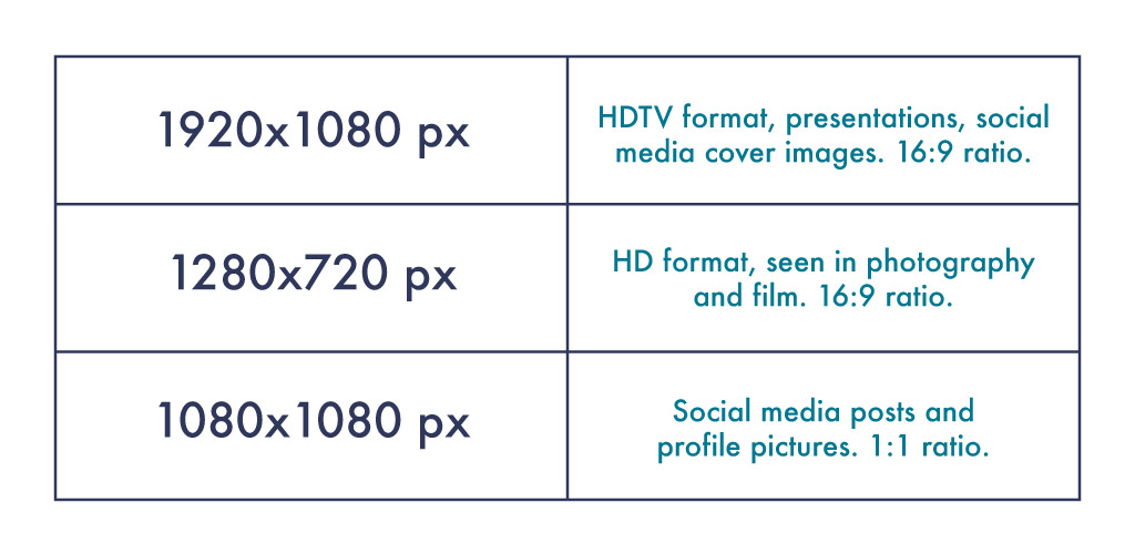
1920 x 1080 pixels
This standard image size is widely seen across high-definition TVs, presentations, and social media cover photos. It follows the 16:9 aspect ratio.
1280 x 720 pixels
This size follows the standard high definition format featured in photography and film. It fits the 16:9 aspect ratio.
1080 x 1080 pixels
You’ll see this 1:1 ratio image size used widely across social media, namely Instagram and Facebook posts.
Common Photograph Sizes
Have you ever wanted to print an image or design, but haven’t figured out which size to use? While you can print an image at any size you want, there are some standard photo sizes that will help you narrow down the options.
Different sizes work in different environments—display larger prints or posters to bring attention to an event or service, and reserve smaller prints for display in homes or on counter space.

We usually measure printed images and photos in inches, although you might see centimeters used in some countries.
Here are some of the most common photograph sizes:

Note: If you’re framing an image, you might need two measurements: the image size and the matte size. A matte is a border around the image that extends to the frame. When you print photographs to frame, make sure you know the matte opening size.
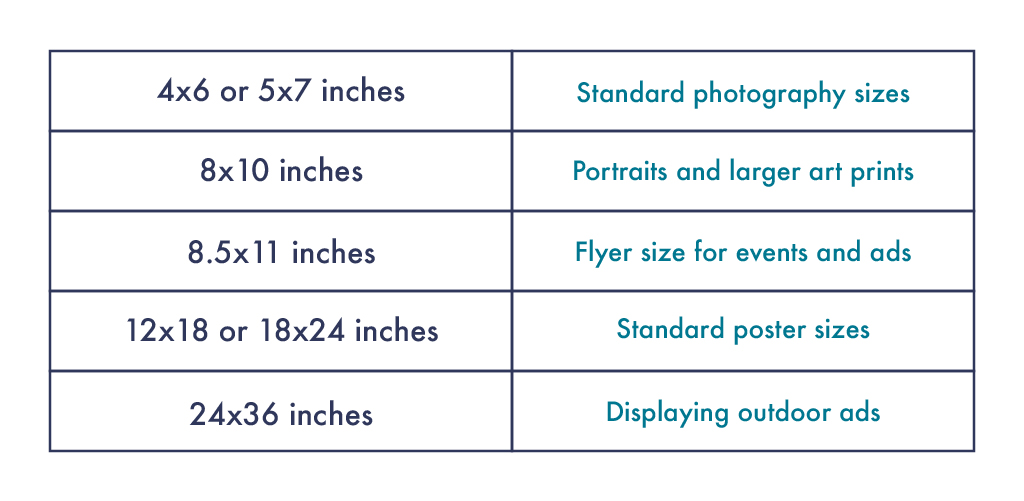
4 x 6 or 5 x 7 in
These sizes are standard and popular photo sizes, typically for displaying photography or smaller artwork.
8 x 10 in
This size is a step above the smaller popular photography sizes, and is common amongst portraits and larger artwork prints.
8.5 x 11 in
Use this standard flyer size for advertisements displayed in areas with limited space. While not as noticeable as larger poster sizes, the flyer size still aims to alert others in smaller settings.
12 x 18 or 18 x 24 in
Larger than typical flyers, these standard poster sizes are ideal when designing for events or advertisements that need to reach a medium audience.
24 x 36 in
Advertisers use this poster size for outdoor advertisements and specified display cases along high-traffic locations.
Creating Custom Image Sizes
Resizing your images shouldn’t be a hassle. Shutterstock’s Image Resizer tool, Smart Resize tool (available as a Creative Flow+ premium feature), and Resize Canvas tool (available to all users inside Create) make it super easy for you to customize your image sizes.
Let’s peek at each of these options and their benefits.
1. Shutterstock’s Image Resizer
Shutterstock’s Image Resizer takes the guesswork out of resizing your own images. Simply drag-and-drop the image of your choice and select the image size on the right.
Once you’ve determined the correct size, hit the Download button and you’re all set.

Note that once you resize your image, you’ll need to drop it into Create. If you want an expedited option, go to Create first to save yourself a step and resize your images (and canvases), all within the tool. Speaking of Create. . . .
2. Shutterstock Create
The moment we’ve all been waiting for, folks. Upon entering the program, you’re prompted to select a canvas size, specific to Instagram posts, Twitter posts, and Etsy banners, for example.
You’ll see each preset size has designated specs for you. Simply click it to open.

After selecting the initial image size for your project, you can upload your own images from the Images tab, search from Shutterstock’s image library, or choose from a variety of templates catered to your image dimensions.
Note that once you’ve selected your preset canvas size (as shown above), uploading or dropping images to the canvas should auto-size to match the whole canvas.
However, sometimes this won’t work if you have a square canvas and rectangle images, as shown below. In this case, simply drag the blue circles to drag-and-drop the image to match the canvas size.
Or, click Canvas > Crop canvas and drag to crop out the extra white space.


Notice that in the first image, there’s an Aspect ratio option. Click that box for a drop-down menu highlighting various aspect ratios to choose from. Easy as pie!
If you ever need to change your canvas specs without compromising image quality, you can do so by heading to Canvas > Resize canvas from the left-hand menu, then entering your own dimensions.

Note that resizing and cropping are two different things. Cropping will eliminate parts of the image, whereas resizing will keep the entire image and canvas in tact. All resizing and cropping options live in the Canvas tab illustrated above.
Phew! It really is that easy. Take comfort in knowing that there are multiple ways to maintain aspect ratio in Create. With proper aspect ratios, you can upload or print your images hassle-free and top-quality.
What’s better than that?
Take Your Project to the Next Level with Shutterstock Flex
Need beautiful photography to form the foundation of your next project? We’ve got you covered.
With Shutterstock Flex, you’ll have all-in-one access to our massive library, plus the FLEXibility you need to select the perfect mix of assets every time.
License this cover image via Beatriz Vera.
Recently viewed
${excerpt}

