![]()
I like to think I have relatively basic needs when I’m traveling for work. But the one luxury I miss when traveling is a second monitor for my laptop, especially when I need to edit The PetaPixel Podcast. But with the Espresso Display 17 Pro 4K, a hotel room can be as effective a work location as my office at home. It’s a transformative product for my workflow on the road.
Announced last October, the $800 Espresso 17 Pro is a 17-inch, ultra-thin, 4K touch display designed to work in tandem with a laptop — Apple MacBooks in mind, specifically — and provide traveling or remote creators the comforts of a second display while on the road.
It’s a simple enough sounding goal, and the first instinct you might have to achieve it is using an iPad as a second display. After using both solutions over the course of the last several months, I’ve landed squarely in the Espresso Display camp. It is easily my preferred option, and I’ll explain why.
Espresso Display 17 Pro: Design and Build Quality
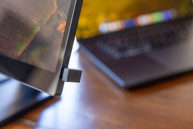
There is very little to be said about the design of the Espresso Display itself, and that’s a good thing. It’s best described as an exceptionally thin, extremely lightweight tablet with dual USB-C ports along one side and a magnetic attachment point built into the back.
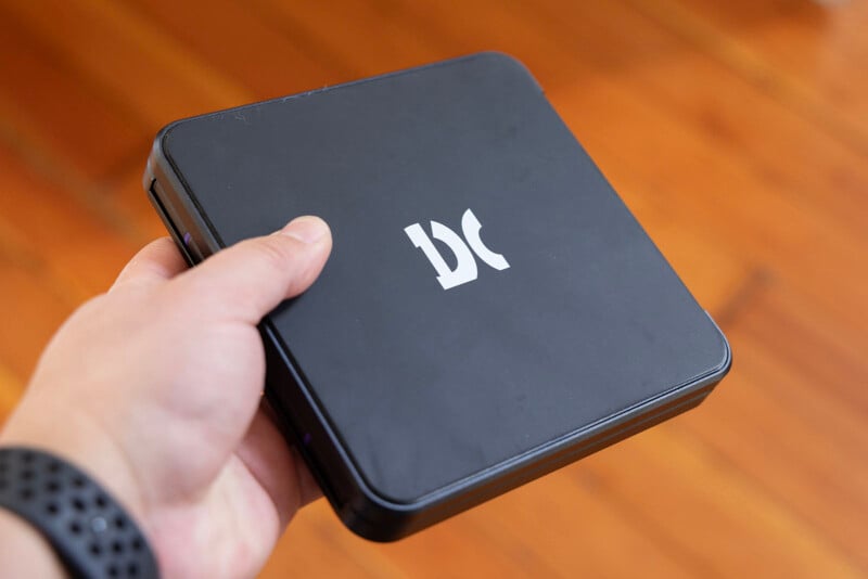
I pulled out my scale and found that the display portion of the Display 17 Pro weighs 1,081 grams (2.3 pounds) while the stand weighs 849 grams (1.9 pounds). It must be how the weight is distributed because in the hand the stand feels like it weighs a lot more than the display portion does. As a point of reference, my 16-inch MacBook Pro weighs 2,149 grams (4.74 pounds).
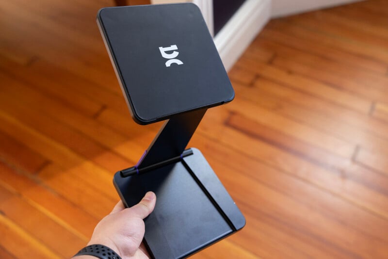
The Display 17 Pro can be used flat on a surface but is designed to work in tandem with Espresso’s Stand Pro which features a very powerful magnet platform attached to a dual-hinged base that allows it to be set up like a typical monitor but has the flexibility to orient in a low-profile layout, too. It can also be arranged vertically or horizontally and the display knows how it is oriented and can adjust accordingly, at least if the free espressoFlow app is installed.
This two-piece design that leverages a very powerful magnet allows the display to function as a single standard monitor when deployed but also breaks down easily into two pieces that fit into a modestly-sized backpack. During my time with this display, I primarily used the Shimoda Urban Explore backpack which features a tablet sleeve in the door of the main access panel as well as a laptop sleeve on the opposite side, accessible via the top hatch.
With this setup, I could pack both the display and my MacBook Pro into the laptop sleeve and an iPad Pro into the tablet sleeve, put the stand into the body of the backpack, and still fit a camera and a pair of lenses in there with room at the top for my tech pouch and other necessities.
I think this is a great example of how well-designed the Espresso Display 17 Pro is. The company seems to really “get” Apple’s tenet of “it just works,” because that’s exactly the user experience. I’ve now traveled across states and internationally this way and the Display 17 Pro has performed beautifully. It’s sturdy, tough, easy to pack down and set up, and connects immediately with my MacBook Pro via USB-C.
While the display is optimized for the Apple experience (Espresso Display tells me that it engineered the experience to feel like an extension of an Apple laptop), it’s not limited to it and will work with basically any computer that supports USB-C displays.
![]()
It’s worth noting that this is a touch display, so the MacBook recognizes it as a touchpad. It also can be paired with an Espresso pen, which allows it to work like a display tablet. I’m not one for editing with a pen and I’m not a fan of that whole interface personally, so my testing was limited to “Does it work?” To that end, yes, it absolutely does. I don’t think it will compete with the drawing experience of something like a Wacom Cintiq, but it will get the job done in a pinch.
Espresso has also designed software — both Jot and espressoFlow — to make the tablet more customizable for workflow and pen uses, which of course increases the value proposition. Personally, though, I didn’t use these much at all beyond verifying that they function as I found the display to be worth its value on its basic premise alone: as a great monitor. If those are of interest to you, though, you can see what the software does and how it works on Espresso’s website via the links above.
Espresso Display 17 Pro: In Use
For photographers and video editors, there are likely two major questions about the Display 17 Pro that need to be answered: “Is it color accurate?” and “How bright is it?”
Espresso says the Display 17 Pro features 10-bit reproduction and can display a billion colors. This is done via FRC, so it’s not going to be a true reference display. However, given its intended use case and $800 asking price, I see no problem with this implementation.
The display (which caps out at 4K resolution at 60 frames per second) is, most importantly, extremely color-accurate. Out of the box with no calibration, testing showed that the Display 17 Pro covered 100% of sRGB, 99.6% of DCI-P3, and 84.2% of Adobe RGB color gamuts with an average Delta E of 0.48. That is exceptional performance for any monitor let alone one that is made to fit in a backpack. After months of use, the display has not deviated from this measurement and has not required calibration.
If there is one Achilles heel of the Display 17 Pro, it’s that it peaks at 450 nits of brightness. That’s not nearly as bright as Apple’s new MacBook Pro or iPad Pro can get, which means if you’re using it alongside your laptop, you will notice the difference. However, while it isn’t as bright and technically is not an HDR display.
I spoke with Espresso to get clarity on this and, long story short, while the company did quality for the HDR400 standard, Espresso didn’t like the quality of their contrast when they abided by it. Additionally, the company doesn’t really think HDR starts until HDR500 or 600 (a stance I actually agree with) and the Display 17 Pro doesn’t quite have enough brightness to achieve those. Espresso decided that, ultimately, it was better to go with better color and forgo HDR support.
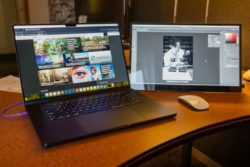
While Espresso is not using an OLED panel — it is IPS — it is behind glass, which mimics the look of Apple’s displays. It honestly feels just like using a mini Studio Display, from the dimensions and the way content looks on it, down to the small bezels and button-less design.
The Display 17 Pro doesn’t have any sort of built-in battery and is instead bus-powered. Once it’s plugged into a computer, the Espresso logo appears, and seconds later it’s on and functioning just like any other HDMI, DisplayPort, or USB-C-connected monitor. Espresso was kind enough to include two USB-C ports, though, so you can attach it to power which then transfers to the attached laptop.
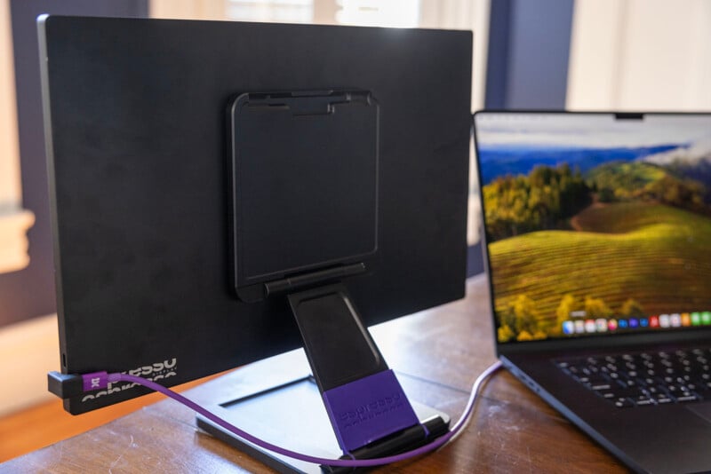
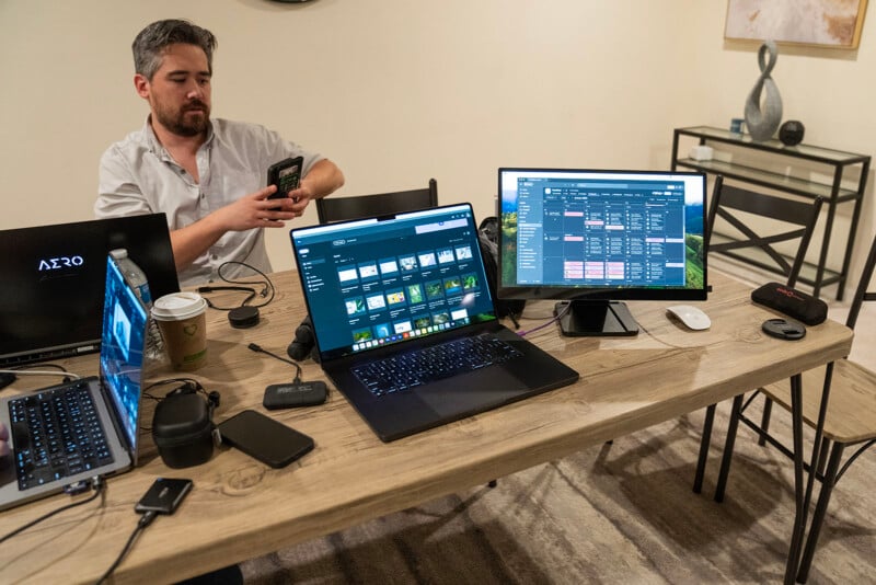
On this note, the Display 17 Pro can get just a little bit brighter if you use that second USB-C port to plug in a second source of power. In one of my photos, below, you can just barely see that I’ve got a MacBook Pro USB-C charger plugged into the display alongside the cable that leads to my computer. If you use both ports like this, one to a laptop and one to a wall charger, the display will get brighter.
That last note is important though, as the tradeoff for performance and resolution is battery drain. A M3 Max MacBook Pro typically has all-day battery life, or at least a full workday’s worth when I’m editing in Photoshop or Premiere. However, when the Espresso Display is connected and I’m going off the laptop battery alone, I’ll experience a full drain in a matter of two to three hours. This display is power-hungry, so you’ll need access to more power if you plan to use it for longer periods of time.
Espresso did think of this, though, and created the Charge: a 32,000 mAh, 118.4Wh battery that is designed to magnetically attach right under the base of the Pro Stand. That is more power than the company initially aimed for and promises to keep the display and attached computer powered enough to last a full day. Power management and analytics on its use can be managed through espressoFlow.
I haven’t used the Charge, but I think it’s likely a worthwhile addition since you’re not always guaranteed to have access to power when you’re on the road and the last thing I want to worry about is running out of juice.
I Never Want to Leave Home Again Without the Espresso Display 17 Pro
Over the last few months of use, multiple colleagues, friends, and acquaintances have seen me use the $800 Display 17 Pro and without exception, every single one of them has expressed the same when they see it: “Wow, what is that?!”
All of us have to travel for work for one reason or another, so that’s probably why what Espresso has made here is immediately enticing. Working off a single laptop display feels constraining and limiting after working with two or more at home, and all of us wish that we had more screen real estate while working out of hotel rooms. The Display 17 Pro fills that gap perfectly.
This is a fantastic display in its own right and is made even better because it’s so versatile and travel-ready. From design to resolution, it’s a major step up from the company’s original HD display and is one of my favorite pieces of tech from the last year.
![]()
Are There Alternatives?
If you’re an Apple user, the most obvious alternative is an iPad Pro. I’ve used it as a second monitor and while it gets the job done (I would say the experience is “fine”), it’s not perfect. The Display 17 Pro is far more specific in its use case as it’s not a standalone tablet, but it does a superior job at being a monitor.
While I have not used them personally, ViewSonic’s VX1655 4K OLED monitor is well reviewed and less expensive than Espresso’s, though it is much thicker and lacks the stand system that makes the Display 17 Pro so easy to like. If the touch interface of the Espresso is enticing, then the Asus ZenScreen is a valid option, though it operates more like a tablet and is smaller. Neither of these alternatives has nearly as good of a stand as Espresso does either.
Should You Buy It?
Yes. While it is more expensive than other options on the market, it is hard to argue with the user experience and quality of the Espresso Display 17 Pro. It combines aspects other portable displays have pieces of into a single unit that’s not only well made, it’s beautiful to look at and wonderful to use.
