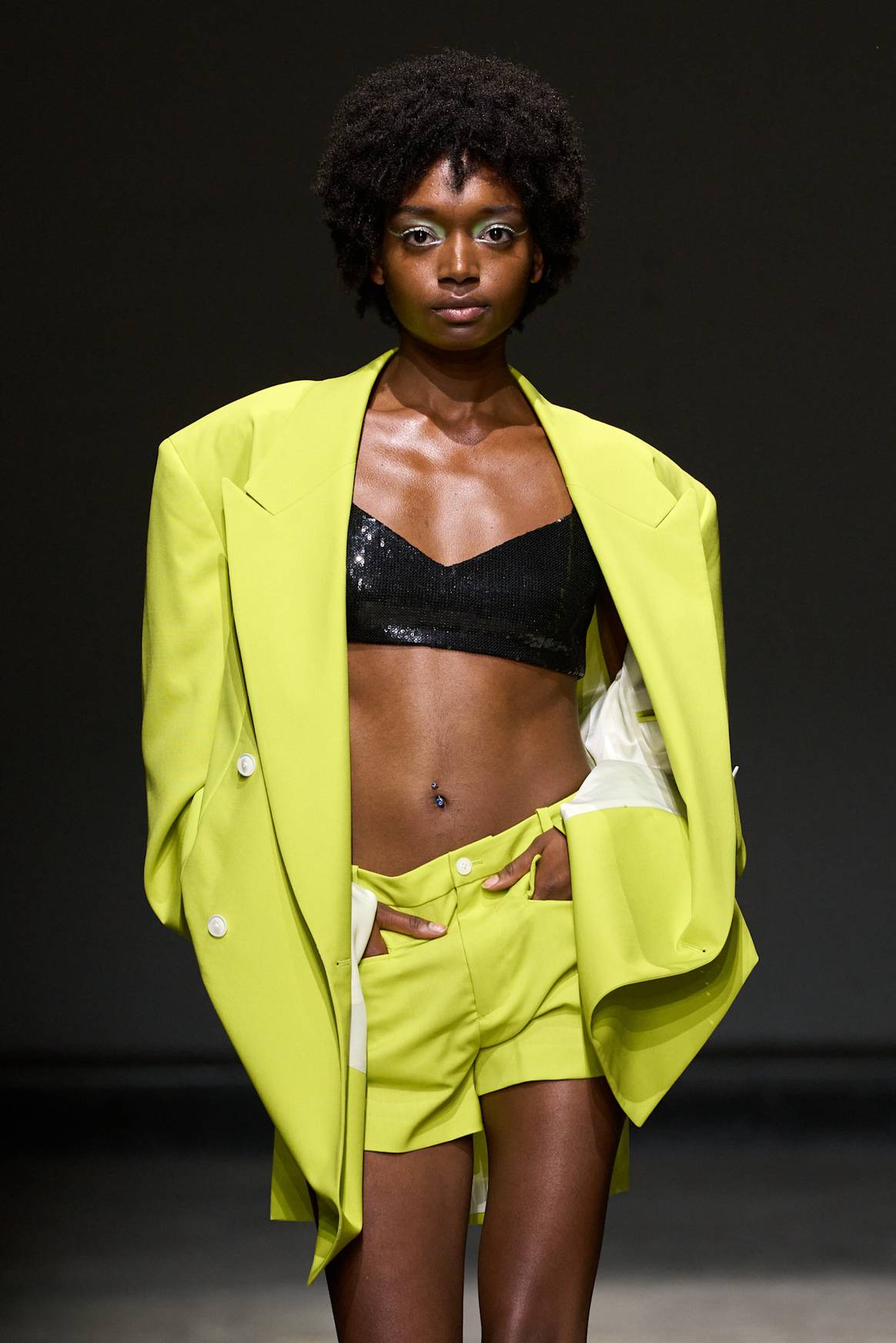
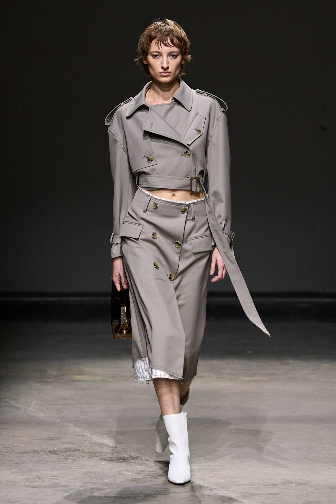
Pantone Color Institute, the global trend forecasting and colour consultancy, has revealed that the colours for the spring/summer 2025 edition of London Fashion Week, which runs until September 17, will combine “romance with practicality for a vibe that is fresh and optimistic”.
Leatrice Eiseman, Executive Director of the Pantone Color Institute, said in a statement: “Colours for LFW spring/summer 2025 inspire a new feeling of liberation. Combining heritage charm with modern sensibilities, this unconventional and multifaceted colour mix is emblematic of our desire to exercise personal freedom, encouraging us to experiment, express and unlock our own original style.”
Pantone describes LFW SS25’s ten standout colours as an “idiosyncratic palette” that “melds comfort with creativity shining a light for a hopeful future”. The palette features a strong chromatic foundation with energetic accents for “moments of magic,” featuring a bright and bold floral peach hue, a calming blue, and an attention-drawing botanical red that is a “force to be reckoned with”.
While New York Fashion Week’s SS25 colour palette was a “harmonious grouping” of bright hues, earthy mid-tones and timeless neutrals, drawing inspiration from the natural world, Pantone states that LFW’s palette has been infused with “a flourish of playfulness and hints of nostalgia,” filled with rich brights, eco-inspired tones, country classics and flawless monochromes that “invites a feeling of liberation with its contrarian approach and inherent statement of modern contrasts”.
Pantone adds that this season LFW designers are opting for confident and strong colours that “stimulate the borders of familiarity, evoking a mood of unabashed freedom of expression that points toward the future”.
Pantone LFW SS25 colour palette
Pantone 14-4122 ‘Airy Blue’ is an expansive, quieting and peaceful sky blue, and its calming presence “evokes a profound sense of serenity”.
Pantone 14-0442 ‘White Grape,’ also on the NYFW SS25 palette, is a pungent green tone with a yellow undertone, which “tantalises and refreshes our tastebuds”.

Pantone 11-0615 ‘Pear Sorbet’ is a discreet aerated pastel. Its pale yellow with a blend of sweetness, offers a “lighthearted vision that softly awakens the senses”.
Pantone 17-5126 ‘Viridian Green’ is a coolly refreshing eco-inspired green-blue, designed to infuse everyday life with feelings of tranquillity.
Pantone 12-0719 ‘Yellow Jasper’ has a luminous warmth that Pantone states sparkles “with optimism,” and “speaks of energy and life”.
Pantone 16-1541 ‘Camellia’ is a bright and bold, yet invitingly approachable vibrant floral hue that sends a “message of freedom and spontaneity”.
Pantone 18-1160 ‘Sudan Brown’ is a naturally rich earth-baked brown tied to the great outdoors. Pantone adds that it recalls “frontier buckskin and well-worn boots,” instilling a contemporary spin on British tradition.
Pantone 18-1762 ‘Hibiscus’ is a botanical red hue with an infectious passion that instantly draws our attention.
Pantone 18-3737 ‘Passion Flower’ is an opulent jewel tone purple that infuses the palette with “a magical aura” as it plays into the growing desire for glamour.
Pantone 19-1528 ‘Windsor Wine’ is “elegance personified,” which evokes the luxury of bygone eras with its full-bodied maroon red that is earthy and warm.
Pantone LFW SS25 seasonless shades
The 10 standout colours for LFW sit alongside five new seasonless hues, which offer “classic and luxurious neutrals that bring comfort and ease,” adds Pantone.
Pantone 14-4309 ‘Secret Spaces’ is a shadowy mid-tone grey with a subtle and modest presence and is described by the colour trend consultancy as a “dependable essential that sets a new pace for simplicity”.

Pantone 18-5206 ‘Thunderstorm’ is a deep and forceful charcoal grey that exudes stability.
Pantone 16-0920 ‘Curds & Whey’ is a natural and nourishing khaki shade, composed and balanced in temperature and tone and is a familiar utilitarian hue with a reliable demeanour.
Pantone 19-1119 ‘Cocoa’ represents thick and rich melted chocolate, a delectable brown hue that “satiates our craving for indulgence” blending humility with a feeling of sophistication and luxe.
Pantone 19-0230 ‘Garden Green’ is a rich plant-based green that “promotes a sense of balance and cohesion”.
