")
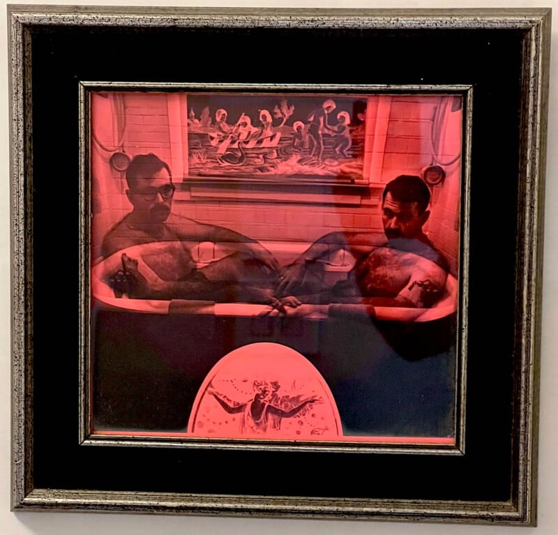
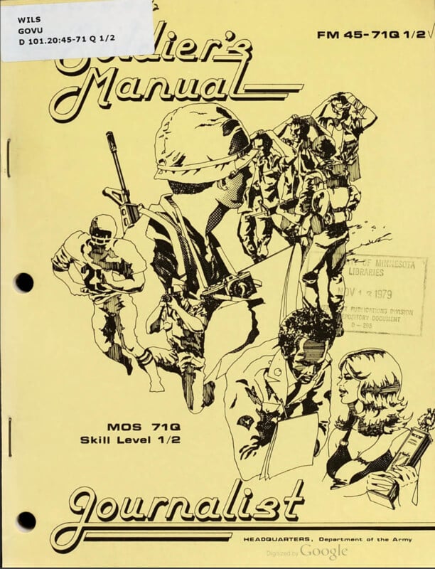
This is a photograph that was on the wall of my house when I was growing up — it’s Jerry Uelsmann’s Self-Portrait as Robinson & Rejlander (1964). I always wondered who those guys were. I was about to find out.
I grew up in a home filled with photography and hundreds of photo books of all kinds; I’d enjoyed learning from dozens of photographers and I’d been taking pictures since I was a kid in the late 1960s — and yet I never heard the expression “rule of thirds” nor seen all the lines and grids in photography until well after college, probably not until the 1990s. And it didn’t fit with anything I understood about taking pictures. So how was that possible for me to have missed such an important, popular, and apparently ancient set of ideas? I spent some time trying to figure that out.
Working with a history professor from Villanova University, Dr. Gina Talley, we spent many months researching where this idea came from, how it evolved, and how and when it was used in education. The full research and exhaustive bibliography can be found here.
This is a more concise outline of our findings.
Deep Background
According to Wikipedia, the first use of the term “the rule of thirds” was in 1797. In his book Remarks on Rural Scenery, John Thomas Smith discussed the balance of dark and light in a painting, and called it the “Rule of Thirds.” He was saying that when given a chance, in pretty much anything that can be divided up, the proportion of ⅓ to ⅔ is more pleasing than other proportions. I think this is true.
This is not, however, how the expression is used today.
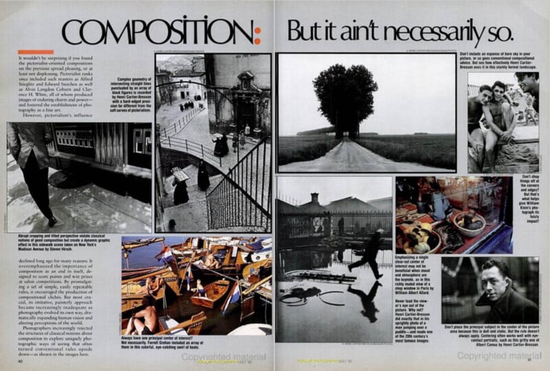
Photographic Pictorialism
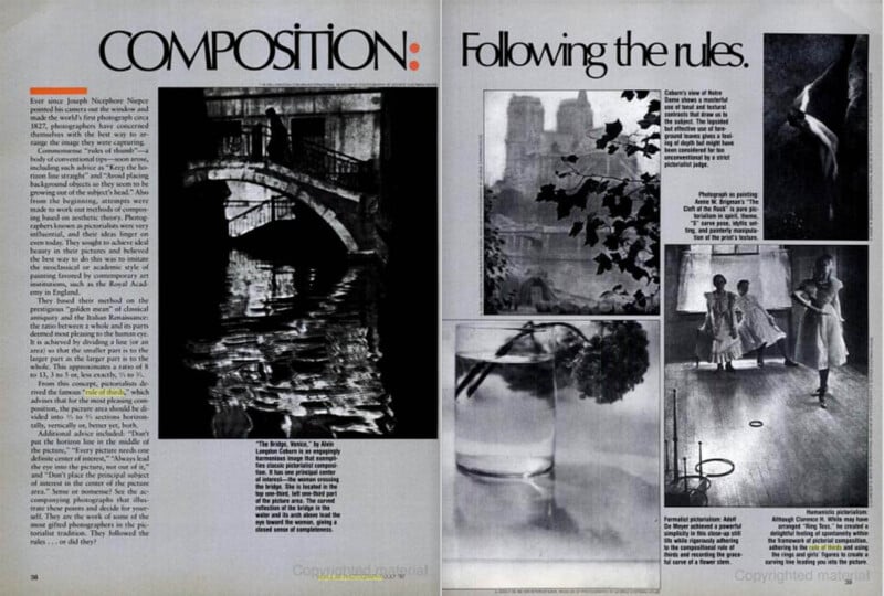
One of the earliest discussions on photographic composition came from a popular book by photo pioneer Henry Peach Robinson in 1869 — the guy on the left in the Uelsmann tub. In it, Robinson emphasized the value of moving the point of interest out of the center of the frame, noting that “if it be an important object, it will never be found exactly in the center…”
The prevailing feeling at that time was that photography produced a mechanical reproduction of the world, devoid of creativity. Robinson, however, felt photography was art. His book drew heavily on ideas from painting, making connections between the two forms; it was foundational to what would soon be called “pictorialism” — and he popularized the idea that if photography was going to be seen as art it needed to emulate the aesthetics of paintings.
The context of pictorialism is important to understand these ideas. In that era, camera exposures were long, which meant subjects were usually not in motion, and consequently, were placed purposefully and by design.
For the pictorialists, one didn’t just push the button; it usually took additional work to transform a snap into “art-photography.” To accomplish this they employed a variety of techniques: softening sharpness, using special papers and emulsions, hand-coloring prints, and combining negatives to create montages. They often chose subjects that were allegorical or mythological and meticulously posed elements and settings to create more formal compositions.
The Origin of a “Rule”: 1908
In 1908, at the height of photographic pictorialism, a photography textbook formalized Robinson’s suggestion, in what is likely the first actual account of the (as-yet-unnamed) phenomena:
The Principle Object of Interest — There must be a principle object of interest in the picture… The crosses indicate positions of strength, the weakest part of the space is the center. The principle object of interest, therefore, should be placed very close to where the lines intersect; that is to say, near but not in, the middle of the picture. [emphasis added]
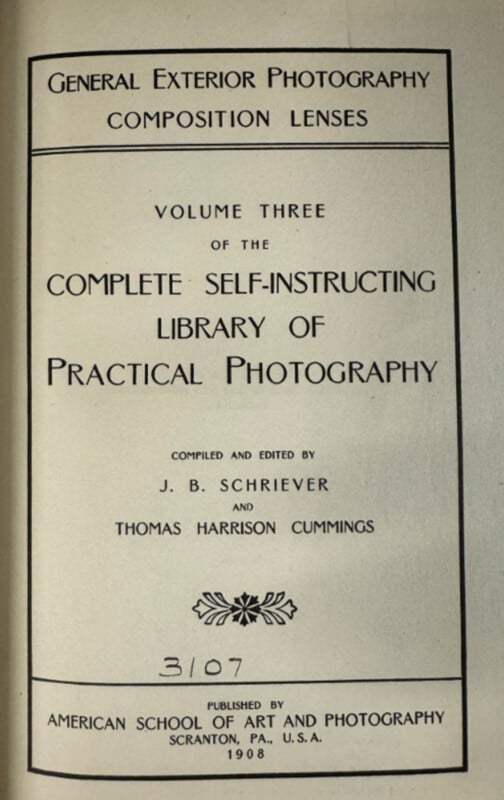
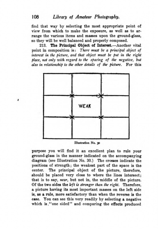
From the Library of Amateur Photography, Vol III (1908 First edition; Unchanged in the 1911 edition). The concept would languish for the next 70 years.
Here, in its original form, it was not a bad rule of thumb. It was not using math or geometry, and it only suggested that photographers move subjects out of the center and toward the edge. It was appropriately soft in its proposal: place the main object “very close” to the cross spots.
The Idea is Named: 1942
As the century progressed, faster film and newer cameras meant moments in motion could be frozen, and pictorialism was replaced by modernism and its more natural approach to shooting. For about 20 years the concept lay dormant. In 1942 the idea was mentioned again, an isolated case, but this time significant only because the name “rule of thirds” was first attached.
From 1869 to 1942, in every case, this compositional tip was the same: that a subject can be stronger when moved out of the center and toward (but not too near) the edge — what I’d call the actual rule. But because modernism was the dominant approach to photography, this guideline was minor and difficult to find in any publications or textbooks.
Pictorialist Guidelines and the Golden Mean: 1940s
While most photographic discourse and education were about modernist approaches, there were still some holdouts. Richard Neville Haile was a photographer in the pictorialist tradition. His credits included Fellow (and later president) of the Institute of British Photographers, Fellow of the Royal Photographic Society, and exhibitor at the Royal Academy of Arts, London.
The first edition of his Composition for Photographers: A Course of Instruction in the Art and Science of Composition as Applied to Portrait and Landscape Photography came out in 1937, and went through seven editions between 1937 and 1952. The book is totally based on a painterly approach (and is mostly illustrated with paintings). He doesn’t discuss the rule of thirds (either in concept or by name), possibly because that tip was specific to photography, and his lessons and examples seem to come entirely from painting.
Unique, however, was an application of the proportions in the Golden Mean to formal composition. In that section of his book, he accurately explained its math, attributed it to Pythagoras, and went on to sum up how it should be used: “we have touched upon the question of Proportion, the Golden Mean; and have seen how important is the Placing of our subject in the picture space…”
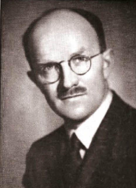
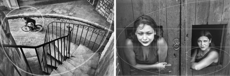
Cartier-Bresson Pushes Back: 1952
It is in this era that the distinguished photojournalist Henri Cartier-Bresson in his landmark photographic treatise “The Decisive Moment” (1952) took a position — not on the rule of thirds, but on the rigid approach to painterly schemas in photographic composition. Cartier-Bresson, as well as being a pioneer in photojournalism, was a trained painter and his book frequently illustrated the differences between painting and photography. And he was likely familiar with the British textbook by Haile, an approach to photography that Cartier-Bresson would have found irksome. Cartier-Bresson literally begged his readers to ignore such pictorialist approaches in picture taking, and trust instincts:
In applying the Golden Rule, the only pair of compasses at the photographer’s disposal is his own pair of eyes. Any geometrical analysis, any reducing of the picture to a schema, can be done only (because of its very nature) after the photograph has been taken, developed, and printed — and then it can be used only for a postmortem examination of the picture. I hope we will never see the day when photo shops sell little schema grills to clamp onto our viewfinders; and the Golden Rule will never be found etched on our ground glass. [emphasis added]
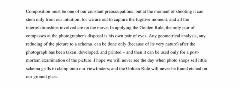
Cartier-Bresson was making a directed dig at Haile’s approach as he made the poetic allusion that the only application of the Golden Rule is through the photographer’s eyes. He was not only referring to Haile, but any formal schema, any geometrical organization of the elements in a photo. He’s building his case for the “decisive moment” when the photographer reveals inexplicable order and visual harmonies in the chaos of life.
The Conflation: 1955
The 1955 British Journal of Photography also pushed back against these lingering pictorialist ideas; it says in one essay: “Do we go around looking for that famous ‘S’ bend known in the best circles as Hogarth’s Line of Beauty? Have we studied the rule of ‘Thirds’ as delineated by Pythagoras? Do we cut the picture into two halves by means of the horizon line? All these points have much to do with the answer as to what is a good print.” It’s an argument against geometry and pictorialists’ ideas, but it was the first time someone conflated the rule of thirds and the Golden Mean. In many ways, it was a mistake waiting to happen.
Haile doesn’t mention the rule of thirds in his works (although he does have some discussion of proportions in landscapes) but he was the one to attribute the Golden Mean to Pythagoras (entirely wrong; it was first described by Euclid in his book Elements in 300 BCE).
The “Golden Mean,” (aka: phi, the Golden Rectangle, the Golden Section, Golden Ratio, and the associated Golden Spiral) is a fascinating observation from Ancient Greece and later connected to the adjacent pairs in the Fibonacci Series. It shows up in nature and the way some things grow; it has been adopted into art and architecture. The Golden Mean is a very important ratio of ~1.618 to 1. But the Golden Mean is unequivocally and fundamentally distinct from the rule of thirds.
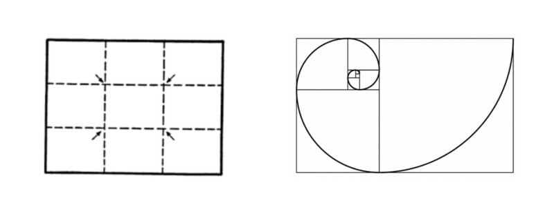
Exceptionally distinct ideas that should never have been joined. Even a casual glance at the illustrations should make clear that the proportions (and rationale) of these two grids are different.
The Confusions of 1959
Something happened in the 1950s to change the narrative and it’s difficult to nail down who is most at fault. The Golden Mean was now sometimes confused with the rule of thirds. The mistakes were small, until they weren’t.
Carleton Wallace, as well as being a crime novelist, penned dozens of self-help books across a range of popular topics. Wallace released at least ten books on photography. In The Complete Book of Photography (1958) that we first see an important modification of this originally useful “rule of thirds” tip. While it remained unnamed here, he created the subtle shift in emphasis from moving a subject from the center to a more exacting placement on the crosshairs — “the points where the thirds intersect are strong positions for the placing for the most important part of the subject…”
By the 1950s the prevailing wisdom on the topic from the few working pictorialists was to move subjects out of the center of photos, the actual rule of thirds. While Haile had proposed that positioning of elements in frame should follow the proportions of the Golden Mean, that specific pictorialist notion was unrepeated and impossible to find mentioned in any other writings. The bulk of photographic interest was with the modernists, and a style articulated by Cartier-Bresson that dispelled the myths of these formal notions. But the mistake was initiated.
Artists and academics still paid little attention. A review of the distinguished photography journal Aperture shows no conversations regarding any of these topics — the Golden Mean, the rule of thirds, and so forth — throughout the decades of the 1950s and 1960s. By 1959, however, the augmented version started to show up in other publications, even as experts tried to push back.
And finally, the Royal Photographic Society produced This Year’s Photography 1959 and mentioned both the rule and the Golden Mean:
No art form can flourish when it is restricted. So let us forget all about what the critics and judges said during the winter months, forget about the magical “golden mean” and “two-thirds,” forget all about the picture that someone else made of the three trees on the hill. If you love trees you will wish to photograph them, trying to portray their majesty or strength or beauty. Do it your way…
The US Military: 1960s-1970s
In 1965, as the Vietnam War was ramping up, these ideas were percolating into the military. It was from the military’s guides that composition training was getting augmented by lessons from pictorialist geometry, ideas largely adapted from Haile’s work.
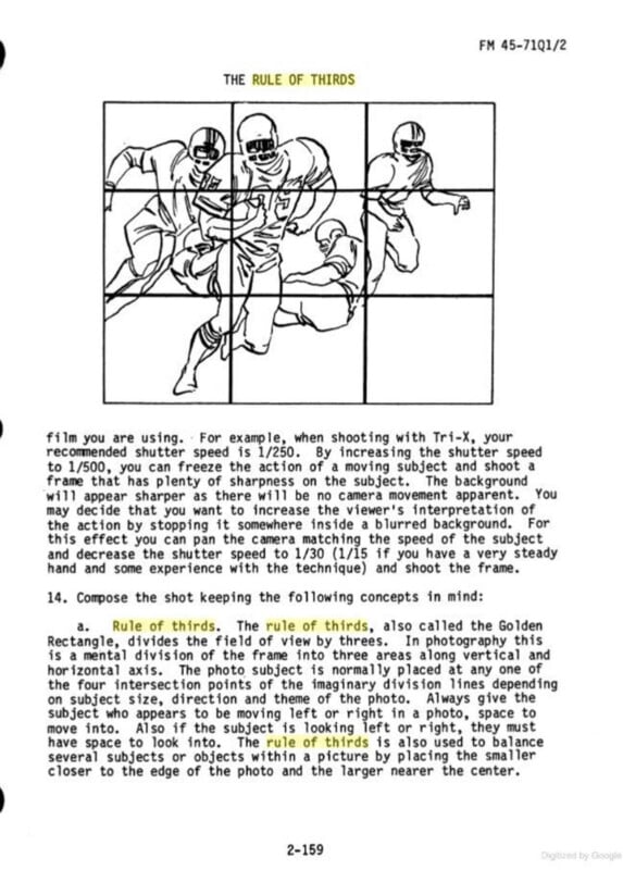
In 1973 the Navy adopted a somewhat official version of the rule of thirds in training materials for journalists learning photography. But by 1979 the Army had expanded it and re-merged with the Golden Mean (aka Golden Rectangle):
The rule of thirds, also called the Golden Rectangle, divides the field of view by threes. In photography this is a mental division of the frame into three areas along vertical and horizontal axis. The photo subject is normally placed at any one of the four intersection points of the imaginary division lines depending on subject size, direction and theme of the photo.
Photography Reaches the General Public: 1970s-1980s
The rule of thirds, even in its bastardized form, might have languished in obscurity if it were not for the explosive rise in consumer and amateur photography that was about to begin.
The modular Nikon F (1959) pioneered the SLR (single lens reflex) camera; it included a number of important features that made it practical and easy; and importantly, for focusing, it offered a split-image rangefinder in the center of the frame — the focusing spot.
Nikon’s success led to other SLR cameras from Pentax and Canon in the 1960s that imitated and refined the approach.
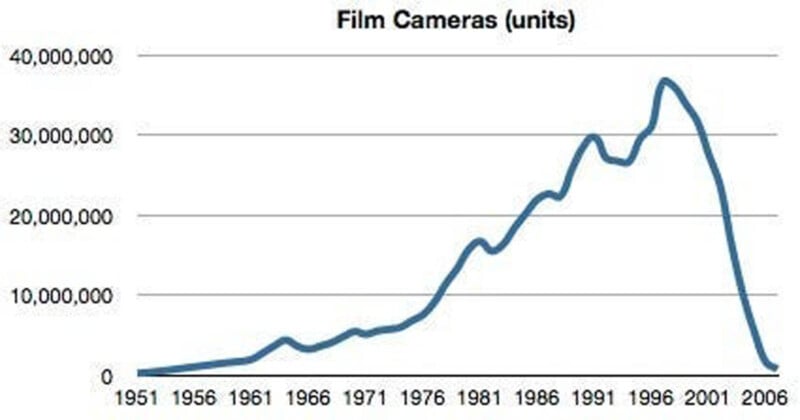
The new amateurs would frequently place the focus spot on someone’s nose and leave it there, in the center of the frame, resulting in awkward and repetitive compositions. It made good business sense to help folks shift up their compositions.
Neither the rule of thirds nor the Golden Mean come up at all in a number of important and comprehensive books on photography throughout this period.
Time/Life, arguably the leading institution promoting photography at the time, produced a popular series of 17 volumes on the topic in 1971, but there is no mention of any geometric principles. The 1974 textbook Photographic Composition advised students to ignore these “rules you’ve been exposed to” and to “observe these placements with an unprejudiced mind.”
And by December 31, 1978 the Camera editor at the New York Times, Roger Snyder, ended the year with the essay “The Old Masters Did Not Follow Definite Rules,” making a case against using schema, as Cartier-Bresson had urged. By the end of the 1970s it felt like the photo industry was working hard to squelch these misguided ideas, but there was pressure from amateur culture and consumer pragmatism to help people take less boring snapshots (as well as to have fodder for educational content).
A 1992 issue of Popular Photography had this amalgam of facts and misinformation to spread, and is typical of the mythology that persists today:
Ever since Joseph Nicéphore Niépce pointed his camera out the window and made the world’s first photograph circa 1827, photographers have concerned themselves with the best way to arrange the image they were capturing.
Common sense “rules of thumb” — a body of conventional tips — soon arose, including such advice as “Keep the horizon line straight” and “Avoid placing background objects so they seem to be growing out of the subject’s head.” Also from the beginning, attempts were made to work out methods of composition based on aesthetic theory. Photographers known as pictorialists were very influential, and their ideas linger on even today. They sought to achieve ideal beauty in their pictures and believed the best way to do this was to imitate the neoclassical or academic style of painting favored by contemporary art institutions, such as the Royal Academy in England.
They based their method on the prestigious “golden mean” of classical antiquity and the Italian Renaissance; the ratio between a whole and its parts deemed most pleasing to the human eye. It is achieved by dividing a line (or an area) so that the smaller part is to the larger part, as the larger part is to the whole. This approximates a ratio of 8 to 13, 3 to 5 or, less exactly ⅓ to ⅔.
From this concept, pictorialists derived the famous “rule of thirds” which advises that for the most pleasing composition, the picture area should be divided into ⅓ and ⅔ sections horizontally, vertically, or better yet, both.
It’s challenging to unpack the ways this twisted history: the “famous ‘rule of thirds’ which advises that for the most pleasing composition, the picture area should be divided into ⅓ and ⅔ sections” was oddly closer to the original original use of the term, from the painter John Thomas Smith in 1797; that was not what the Greeks had noticed, and it was not how the expression had been used in the 20th century, and the pictorialists didn’t base their compositions on the Greek principle, nor did they base their tip to move subjects out of the center on any of these ideas, although it was a “painterly” way to approach a subject. The passage seems mostly to be referring to Haile — it was his background with the Royal Academy that lent some credibility to his Golden Mean approach, but it was neither a method used by pictorialists nor was it foundational to the development of the rule of thirds.
Regardless, from this and countless other books and articles throughout the ’80s and ’90s, the new rule ossified into conviction.
By conflating the rule of thirds with the Golden Mean, the soft rule of thumb was imbued with a charge of mathematical exactitude and the respectability of history.
Recap
- The expression “rule of thirds” was coined in 1797, but to mean something else. This was not the origin.
- The actual origin of the (unnamed) photo tip was in 1908 at the height of pictorialism formality, but only to help photographers move subjects out of the center of an image towards an edge, but not too near.
- In 1942 it was named and codified, although still a minor idea.
- Pictorialist Richard Neville Haile introduced the use of the Golden Mean to photography in the 1940s, but it was unrelated to the rule of thirds, and it was vehemently argued against by HCB in 1952.
- Pop-author Carleton Wallace likely popularized the “modern” erroneous version of the rule of thirds in his books, and in 1963 conflated it with the Golden Mean — the first significant author to do so.
- The amalgamated version was largely ignored, but due to adoption by US military, got amplified for decades, out of the view of the public.
- The amalgamated version still languished until the 1980s when it crept into more textbooks and photographic journals, and by the 1990s was enshrined as dogma.
Conclusions
The rule of thirds evolved in a world where photography was very slow and the positioning of elements in the frame — usually portraits or landscapes — were highly considered. Modernism rendered it moot because fast film and newer camera technology allowed for more dynamic content and composition became entirely instinctual. And while the modernists would certainly ignore a schema approach, even the pictorialists were quick to point out that you couldn’t really follow a form, in spite of their desire for formality.
Formal schema of any kind ignore an important and fundamental aspect of photography: the things in the frame are not geometric objects with Cartesian coordinates, but complex shapes with meanings and associations. The way the human eye scans a scene is certainly dominated by the lighting, but it’s generally understood to be driven by knowledge and culture — what we know drives what we see. The brain fills in incomplete information. And the photographer is a master of giving viewers various kinds of incomplete information (a flattened and cropped view, a blurry or darkened element, the interpretation of a facial expression, etc.) for them to experience. Objects have relationships with each other, juxtapositions have multiple meanings. All of these drive photographic compositions, and none are based on geometric forms.
Current textbooks on photography continue to repeat the rule of thirds/Golden Mean connection, often doubling down on its importance and longevity, when in fact it has neither. It even spawned a cottage industry of “rules” of composition connected to geometric forms, unrelated to how the human visual system works and equally unrelated to the ways interesting photographs are composed.
While there are similarities, photography is not an application of graphic design principles. The Golden Spiral (and other geometric guides) were appended relatively recently, and by accident. In spite of their lazy appeal (and how cool illustrations look) these rules are unrelated to understanding photographic composition and probably make the actual development of compositional skills harder to articulate. While graphical artists might use these ratios as a scaffolding for design and painting, photos aren’t built from a scaffolding, and instead are a complex world winnowed down with a camera.
Once the notion of geometric schema is placed in a student’s head, it can be very difficult to unlearn it to begin to explore what photographers are actually doing when they take pictures. But this is precisely the nature of these schema in education today: learn them, then you can forget them.
While I believe it’s up to an instructor if they want to use the rule of thirds or the Golden Mean to help teach a student — it’s simply wrong to pretend those methods are fundamental or historic. The rule of thirds, to move something out of center frame, is a pictorialist idea but not based on anything in particular. The Golden Mean has no history in photographic education, was added in the modern era, and is definitely not the same as the rule of thirds.
Teaching Composition
I believe the issue is less about the rule of thirds than it is “if not this, than what?” How do you explain how photographers unconsciously compose their images? How do you teach a feeling? It seems like the right question to ask.
It’s been a thorny issue for more than a century; difficult enough that amateurs grope for any kind of mythology to cling to. I don’t agree that it cannot be taught, only that it can’t be taught through geometry.
In 1955, Aperture magazine had an editorial arguing for a new language for photography, quickly focusing on “composition”:
We apply the word “composition” (borrowed from painting mainly) to photographs. This does not describe the action of a photographer isolating a picture on a ground glass or through a view finder with any accuracy whatsoever. Is there a word that will really describe what goes on?
My new approach to teaching photographic composition is an alternative. The Art of Composition — Reimagined, with the Santa Fe Photographic Workshops, is available this August.
This article was excerpted from Rubin’s upcoming book on photographic composition, The Art of Composition — Reimagined © 2024 MH Rubin, All Rights Reserved.
This work is a collaboration with Villanova history professor Dr. Gina Talley, whose efforts and research skills were invaluable. If you find additional references to these issues, this is a working document, our best understandings at this time, and happy to continue to refine as information is discovered.