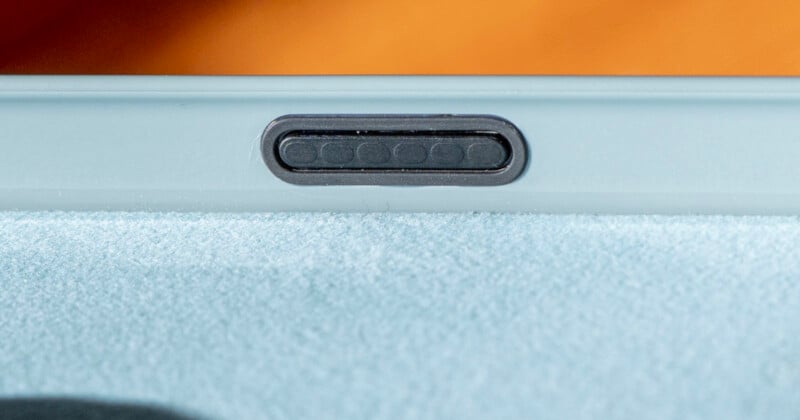
Apple’s iPhone 16 series has a new touch-capacitive, haptics-enhanced Camera Control button and, at launch, only Apple, Beats cases, and one Otterbox case have built-in technology that lets it work as well as it does with no case at all.
First, Camera Control on iPhone 16
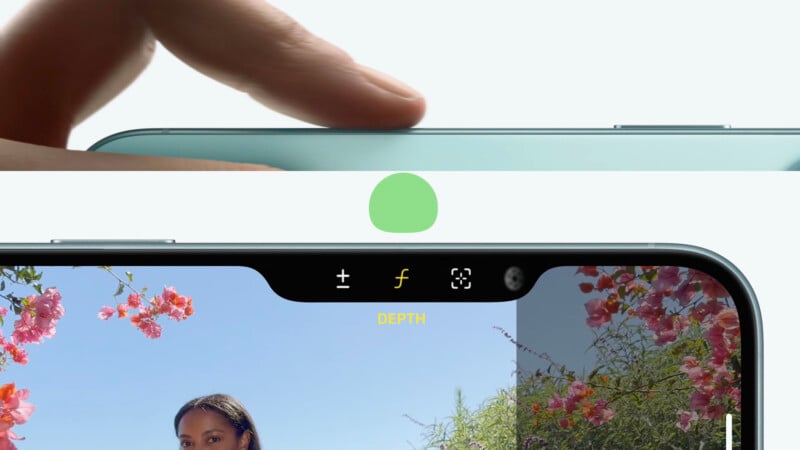
Instead of simply replicating the expected button experience Apple has around the rest of the iPhone, it went the extra mile to make something that could both feel like hitting a real camera shutter while also building-in touch support. In its explanation of the Camera Control button during the keynote last week, Apple wanted to create something that could perform multiple tasks without asking a user to move their finger.
The button is flush to the surface and covered by a smooth sapphire crystal and then surrounded by a color-matched stainless steel trim. Additionally, a small multi-pixel capacitive sensor and signal processor are housed under that sapphire crystal so that the button can recognize touch gestures. The arrangement of those touch sensors corresponds to the layout of the six little bumps found on the inside of Apple’s cases (a fact that we’ll come back to).
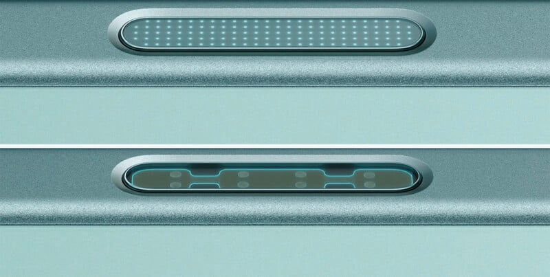
Under the button is a tactile switch which enables a “click” and a force sensor interacts with Apple’s Taptic Engine to provide additional haptic feedback that is meant to mimic a mechanical shutter.
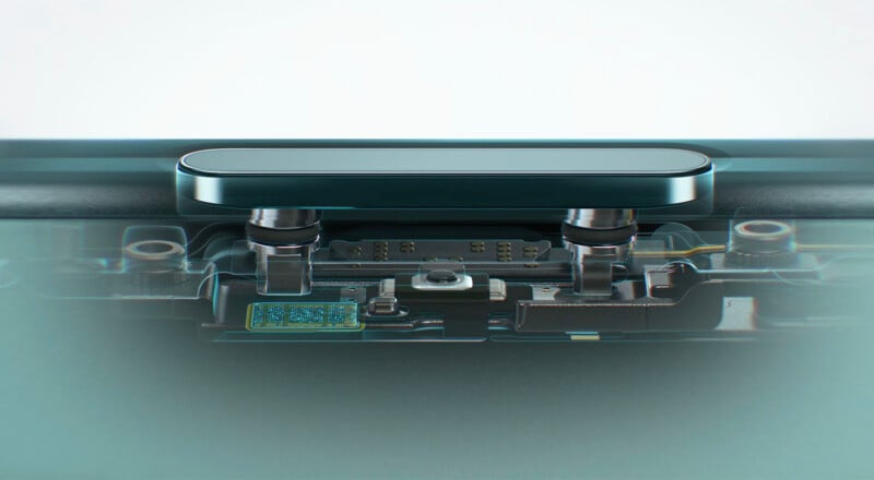
Apple says it put a ton of innovation into the creation of this button and that effort continues into the design of its cases.
An astute viewer may notice that the Camera Control button is where Apple used to place the mmWave 5G cellular band on its iPhone models sold in the United States. Apple says it did remove it, but only because it was able to combine it with its existing bands found near the top of the phone and was able to do so without any compromises to performance.
Tons of Tech in Millimeters of Space
It’s really hard to appreciate this new button by looking at Apple’s iPhone 16 case options on its website. The cases are pretty true to how they appear from a color perspective but the side where Apple’s new button lives isn’t visible. To see this addition, you have to get one of these cases in your hands. Beats does a better job and actually highlights the compatibility with the Camera Control button.
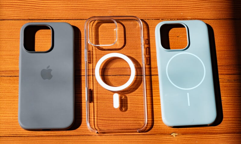
On these new compatible cases are five button placements but one of them is not like the others. Instead of just being a softer piece of the surrounding material, this fifth button is not only a different color than the rest, but it is also built completely differently.
On the outside, it is unremarkable. It is shiny and inset rather than made from the same material as the case and is also not lifted up like the other button cover sections, but those are the only differences that are discernible at first blush. But of course, there is more to it than that.
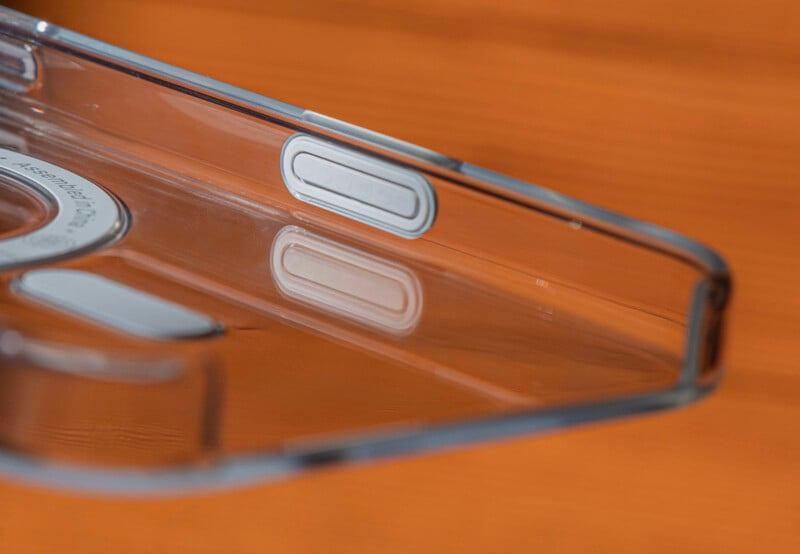
On the inside it’s more obviously special: there are six tiny embossed nubs on the inside of the button at the part that touches the new Camera Control button on the iPhone 16 Pro and Pro Max.
How Apple’s Camera Control Button on Its Cases Works
Just adding a new touch-sensitive button to the side of the iPhone cascaded into a remarkably complex series of designs.
At a high level, Apple basically replicated the sapphire crystal-capped button portion of its Camera Control and set it into its cases. Getting in deeper, the button is constructed from seven layers and on the inside of the case — the part where the six little bumps are visible — there is a thin silicon seal that is optimally aligned to the Camera Control button to allow for seamless tensor performance.
It’s the same technology Apple initially developed for the iPhone 16 series, but it was repurposed for the cases because the company’s goal was to enable a touch sensing experience that is high fidelity enough that a user wouldn’t see the difference in use between the case and phone.
In PetaPixel‘s testing, this was a success.
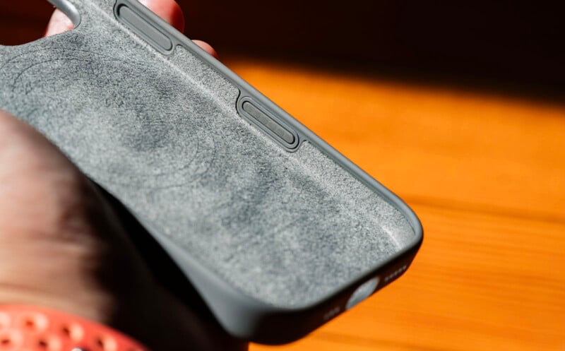
Looking at how Apple describes its Camera Control button, the little bumps on the inside of the case are what transmits the touch controls from the outside to the inside, which is particularly neat considering the case doesn’t require any power. Apple probably didn’t need to go this far for a thin mix of glass, plastic, metal, and silicone but it did, and the experience with these special cases is just that little bit better than what you can find from almost everyone else.
A Very Extra Button
That’s a remarkable amount of technology crammed into an ultra-thin button that is for all intents and purposes, a flex. For other third party case makers who don’t yet have access to the information on how to replicate that button, a simple cutout was the most elegant solution. Rather than a button, the iPhone 16 cases from Moment, for example, just have a hole. Same with the cases from ShiftCam. Not all cutouts are created equal, however, as Otterbox opted to go with a truly giant one on some of its thicker cases.
This is the same approach companies took back when Apple had the “silent” switch that was replaced by the Action Button on the iPhone 15 Pro series. For all intents and purposes, direct access to the iPhone 16’s Camera Control button is as good as Apple’s button.
Sure, Apple’s cases are just that slight bit more protective, but it’s minor. You could make the argument that cases with that special button just “feel” more complete, since it integrates so well to the side of the case. That said, it’s probably not hard to get used to the feel of the cutout.
Some users might not be able to look past the cutout and for those people, Apple and its sub-brand Beats are the only ones with multiple options with integrated solution. Otterbox is the only third-party brand that offers any Camera Control case at all and that’s reserved for its Lumen series, which goes to show that Apple didn’t keep this little button entirely to itself. Otterbox is the lone third-party manufacturer who got access to this tech at launch, however. When Apple’s case documentation is provided to other third-party case makers, it remains to be seen if they are going to be willing to take on the added effort to go as “extra” as Apple did when the option they all have access to today may not make the experience that much worse.
Whatever the case, what Apple has created is quite the little tech-filled button.
Image credits: Unless otherwise noted, photographs by Jaron Schneider
