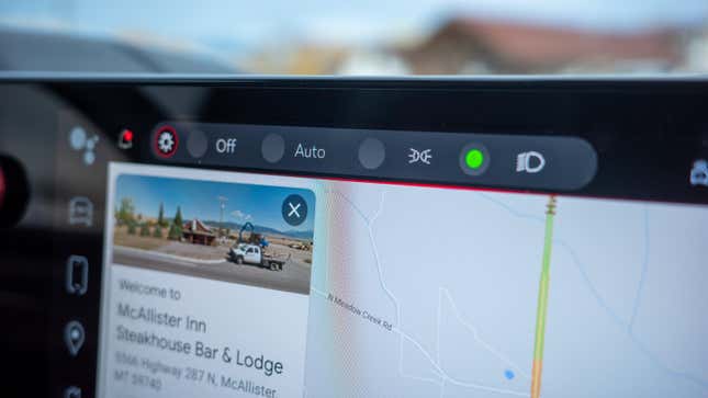
With all the latest evidence that roads in the U.S. are getting more dangerous, it’s a mystery why touchscreens continue to flood our cabins. What good are laws stating we can’t use our phones in our cars when there’s an even bigger screen floating on the dashboard? I don’t get it. In light of that, what settings or features do you think should never be placed behind a touchscreen?
I understand that in-car navigation and reverse cameras require a screen, but automakers insist on putting more and more functions behind a touchscreen. Tesla is one of the companies that gets a lot of flak for its screens, having been one of the first to pioneer such bright ideas as making windshield wipers and glove-box latches controlled by a screen, as our friends at the Autopian show.
Other carmakers such as GMC and Chevrolet have followed suit, removing something as sacrosanct as a light stalk and opting to put headlight operation behind a menu in a screen. The counterargument goes something like, “the headlights are automatic, so you don’t need to switch them on or off.” But I don’t care how auto those lights are. I want a way to make damn sure they’re on, thanks. My vote is headlights should never be behind a screen. What are yours?

